More and more of my customers have the request for heatmaps and usability metrics. While my snide comments of “eye candy” were my own personal thoughts originally, I decided to think and study the use of heatmaps to help improve the customer experience.
What Do People Do with Heatmaps?
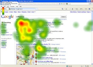
My first real thought was “what do you really do with a heatmap”? A lot of folks in the Search Engine Optimization space use them to check their ad effectiveness. As seen below, the hotter part of the screen (red) indicates where the majority of users clicked. You can see on the far left, some clicks in green, but most are around the top of the page, to the left.

Okay, if I’m placing ads, I get this. In the end, what people want is some other way to visualize where people are navigating to make the page “better”.
What are People Hoping to Gather?
I have asked my customers and most of the metrics and statistics they are looking for are as follows:
- % of people who click an item or menu
- % of people searching vs. browse the page
- People who are scrolling down
- Tracking mouse overs and movements
- Do people use all the fields presented?
- Do they click the call to actions
- Do they navigate with the sidebars or heading tabs
- Are the carousels or other widgets being used?
What are Good Questions to Ask?
While a bunch of metrics are great to have and save for analysis paralysis, this leads us to the place to begin, what questions do we really need answers to?
- Does traffic source influence which clicks do people make? Do I need landing pages for every campaign or can I just use the home page and everyone gets what they want?
- Do people click on the image or text ads on the site? Do people even click ads?
- Are people clicking on the main call-to-actions on the page?
- Are key components grouped together nicely? This will help to prioritize the page layout.
- Are people finding what they want quick enough? Are they clicking on “About Us’ to get to “Contact Us”
I realize a lot of marketing folks really like heatmaps since they convey a pretty picture, but like any tool, without the right context and questions, they tend to only generate red herrings (tangents that are a fun journey but not that useful). The best use of heatmaps is to establish a process for usability metrics and a strategy to integrate with Multivariate Testing and Customer Experience Management systems.
